
Your real fish, your real quests, your real terrain
A shorter cycle this time, but a satisfying one: a batch of “oh, that’s what was bugging me” fixes, plus the first pieces of a whole new decor theme. Standing back afterwards, I noticed they all shared a thread: making things show you the truth.
Every fish looks like itself now
The My Fish screen had a quiet lie in it. Every card showed the stock species artwork, so two of your guppies could be completely different animals in the tank, one sunset-orange and one ghost-pale, and their cards would be identical twins.
Fixed. Each card now renders that fish: its sprite variant, its personal colour (the little hue and brightness shift every fish is born with, pushed wider on the “Striking” and “Delicate” ones), and its morph if it came out of Sy’s Breeder’s Box. The way it works is my favourite kind of solution: instead of trying to redraw the fish on the card, I put the actual swimming shader on the card and froze the wiggle. So the card isn’t a copy of your fish; it’s the same colour maths, run again. It can’t drift out of sync, because there’s nothing to drift from.
(The cleanup crew still get stock art: their variation is much subtler, so I left them be.)
The sponsors got a proper quest journal
The Sponsors screen was a scrolling stack of cards. It’s now a two-pane mission log.
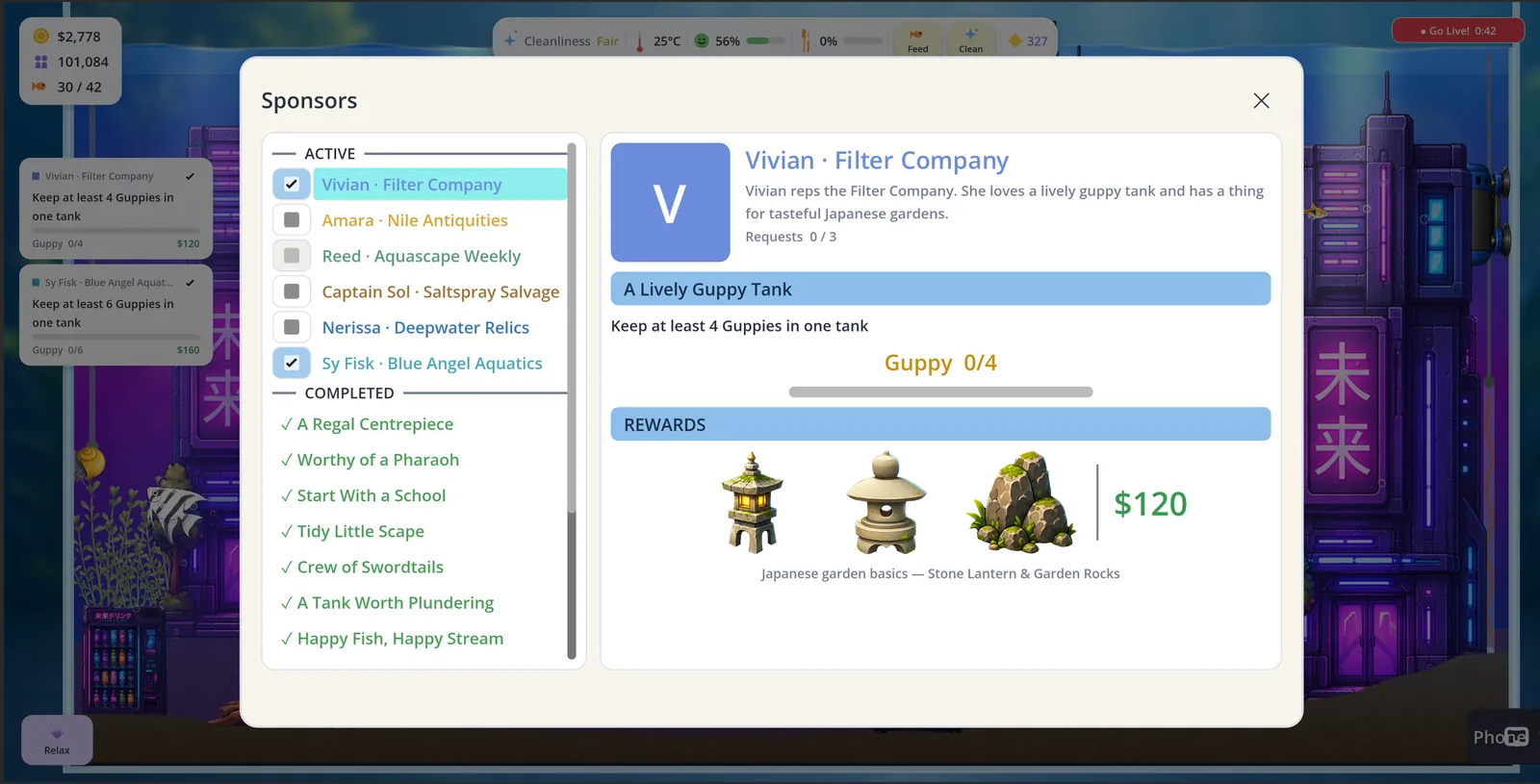
On the left, every quest is its own row, split into Active and Completed and colour-coded by sponsor, and anything ready to collect gets a ”!” and floats to the top. Completed jobs finally have names (“A Regal Centrepiece,” “Worthy of a Pharaoh”) instead of listing the same sponsor five times in a row. On the right: the portrait and blurb, the goal with a live progress bar, and a Rewards strip showing the actual art of whatever you’re unlocking, right next to the money. Being able to see the stone lantern you’re working toward turns out to matter a lot more than reading its name.
Small victory buried in there: the selected-quest highlight had never once worked, because Godot quietly ignores style overrides on flat buttons. Took me an embarrassing while to figure out. It lights up cyan now.
Things that were pointing at the wrong place
Two fixes in the same spirit. The phone’s bottom dock is now My Fish · Aquascape · Phone · Store, the four things I actually reach for, My Fish has a fish icon instead of a heart, and the dock and the app grid finally agree on whether it’s called “Shop” or “Store.” (It’s Store.)
The other one was uglier. On the phone build, the tutorial bubble would sometimes plant itself right on top of the button it was telling you to press. A soft-lock, in the tutorial, on the platform I’m targeting. The cause was the on-device UI scaling inflating the bubble in a way my placement maths never saw coming. So now the bubble checks its own work: after everything’s laid out, it measures itself at its real size, and if it’s covering the target it hops to the next spot in its list until it isn’t. It physically cannot hide the thing it’s asking you to tap anymore.
Algae that hugs the terrain
The grassy algae film ran in a dead-flat band across the tank, blithely ignoring all those dunes you’d carefully sculpted. Now the fuzz follows your landscape: the growth band, the little tufts, and even where the cleanup crew go looking for it all track the real sand line, rising and falling over your hills. Pour or dig and it re-aims itself live.
Fun side-effect: this exposed a test I’d quietly broken with my own landscaping. It spawned a prop at a fixed height that my growing dunes had swallowed. It now places itself relative to the local sand, so it doesn’t care what the terrain’s doing.
New neighbourhood: the Cyberpunk set 🌃
And now for something completely different.
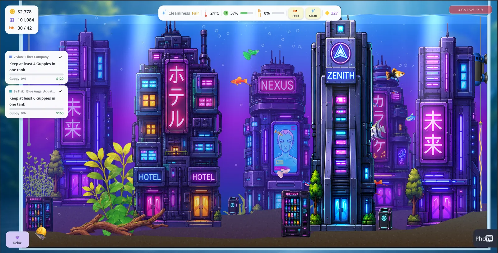
Seven pieces to start: the Neon Spire, Nexus Tower, Neon Hotel, Zenith Tower and Karaoke Tower are landmark skyscrapers, the tallest decor I’ve made, built to anchor a skyline, plus a Future Drinks Machine and a Neon Recycler to nestle at their feet. All buyable right now.
They’re ungated for the moment, because none of my sponsors fit a neon vibe; the whole cast is naturalistic, historical or nautical. That turned out to need a bit of architecture: the store could only group a themed row from its unlock gate, which meant “ungated” and “sold as a set” were mutually exclusive. Grouping and gating are separate concerns now, so any set can be a titled row without a lock, and if a neon-tech sponsor turns up later to adopt this lot, that’s a small change away.
Next for the theme: crank each piece’s glow so the neon fluoresces under blacklight. I have a feeling these are going to look absurd in bioluminescent mode, in the best way.
What’s next
More neon, probably. But mostly I want to sit with the city a while and see how it plays with everything else in the tank.
Thanks for following along. 🐟