
Redesigning the aquascape menu
The menu where you actually place plants and rocks started life as a plain list. Functional, but it covered the tank (see rule from devlog #2) and showed no art: just text.
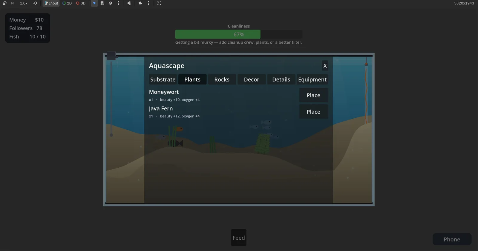
I sketched a wireframe: dock it to one side so the tank stays visible, switch to a grid of cards with a thumbnail for each item, and move the categories to a vertical rail.
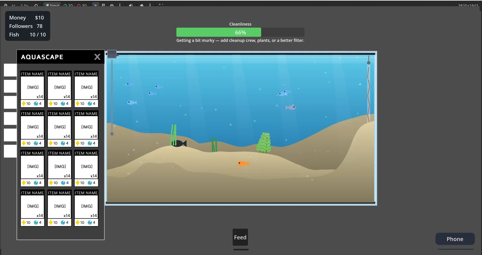
Then I built it. The chrome came out clean: real category icons, tidy cards, the tank visible the whole time.
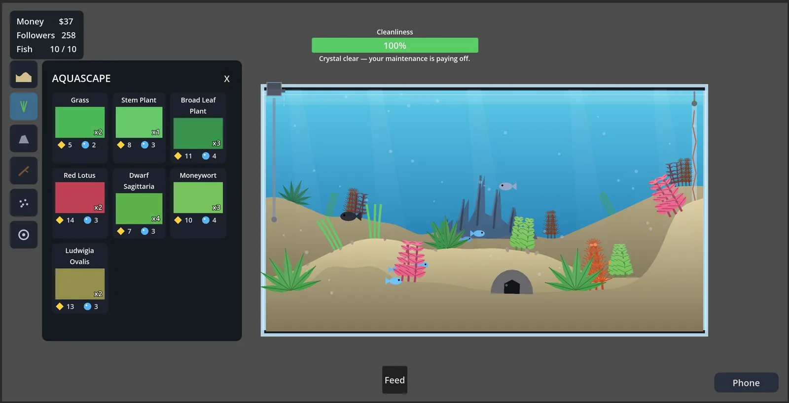
The honest part: the menu stopped looking like programmer art, but the item thumbnails are still flat color swatches. For an art-led game, those thumbnails are exactly what players look at when choosing, so that’s unfinished business. It also surfaced a design question I keep circling: is this a shop or an inventory? Right now placing decor looks free, which means money never really touches the scaping. I haven’t decided if I want it to.